To apply this component, add the .uk-button class to an <a> or <button> element. Now you have created a button. Add the disabled attribute to a <button> element to disable the button.
NOTE If you are displaying a number of buttons in a row, you can add a top margin to them, when they stack on smaller viewports. Just add the data-uk-margin attribute from the Utility component to their parent element.
Toggle between a group of buttons like a checkbox by wrapping a <div> element with the data attribute data-uk-button-checkbox around them. This can also be applied to a button group.
Toggle between a group of buttons, like radio buttons, by wrapping a div element that uses data-uk-button-radio around them. This can also be applied to a button group.
A button can be used to trigger a dropdown menu from the Dropdown component. Just add the .uk-button-dropdown class and the data-uk-dropdown attribute to a <div> element that contains the button and the dropdown itself.
<!-- This is the container enabling the JavaScript --><divclass="uk-button-dropdown"data-uk-dropdown><!-- This is the button toggling the dropdown --><buttonclass="uk-button">...</button><!-- This is the dropdown --><divclass="uk-dropdown uk-dropdown-small"><ulclass="uk-nav uk-nav-dropdown"><li><ahref="">...</a></li><li><ahref="">...</a></li></ul></div></div>
Button group with dropdowns
Use button groups to split buttons into a standard action on the left and a dropdown toggle on the right. Just wrap a <div> element around the button and the dropdown and add the data-uk-dropdown="{mode:'click'}" attribute. Of course, a dropdown can also be applied to a button within a button group.
<divclass="uk-button-group"><!-- This is a button --><buttonclass="uk-button">...</button><!-- This is the container enabling the JavaScript --><divdata-uk-dropdown="{mode:'click'}"><!-- This is the button toggling the dropdown --><ahref=""class="uk-button">...</a><!-- This is the dropdown --><divclass="uk-dropdown uk-dropdown-small"><ulclass="uk-nav uk-nav-dropdown"><li><ahref="">...</a></li><li><ahref="">...</a></li></ul></div></div></div>
Create a smooth off-canvas sidebar that slides in and out of the page.
The Off-canvas component is perfect for building a mobile navigation, similar to those which are popular with many native mobile apps, where a single button in the upper left corner toggles an off-canvas sidebar with a menu.
The Off-canvas component consists of an overlay and an off-canvas bar.
Class
Description
.uk-offcanvas
Add this class to a <div> element to create the bar container and an overlay, blanking out the page. An id also needs to be added, so the off-canvas sidebar can be toggled.
.uk-offcanvas-bar
Add this class to a child <div> element to create the off-canvas bar.
You can use any element to toggle an off-canvas sidebar. An <a> element needs to be linked to the id of the off-canvas container. To enable the necessary JavaScript, just add the data-uk-offcanvas attribute. If you are using another element, like a button, just add the data-uk-offcanvas="{target:'#ID'}" attribute to target the id of the off-canvas container.
Lorem ipsum dolor sit amet, consectetur adipisicing elit, sed do eiusmod tempor incididunt ut labore et dolore magna aliqua. Ut enim ad minim veniam, quis nostrud exercitation ullamco laboris nisi ut aliquip ex ea commodo consequat.
Duis aute irure dolor in reprehenderit in voluptate velit esse cillum dolore eu fugiat nulla pariatur. Excepteur sint occaecat cupidatat non proident, sunt in culpa qui officia deserunt mollit anim id est laborum.
Markup
<!-- This is an anchor toggling the off-canvas sidebar --><ahref="#my-id"data-uk-offcanvas>...</a><!-- This is a button toggling the off-canvas sidebar --><buttonclass="uk-button"data-uk-offcanvas="{target:'#my-id'}">...</button><!-- This is the off-canvas sidebar --><divid="my-id"class="uk-offcanvas"><divclass="uk-offcanvas-bar">...</div></div>
Add the .uk-offcanvas-bar-flip class to the off-canvas bar to adjust its alignment, so that it slides in from the right.
Example
Lorem ipsum dolor sit amet, consectetur adipisicing elit, sed do eiusmod tempor incididunt ut labore et dolore magna aliqua. Ut enim ad minim veniam, quis nostrud exercitation ullamco laboris nisi ut aliquip ex ea commodo consequat.
Duis aute irure dolor in reprehenderit in voluptate velit esse cillum dolore eu fugiat nulla pariatur. Excepteur sint occaecat cupidatat non proident, sunt in culpa qui officia deserunt mollit anim id est laborum.
<!-- This is the button toggling the off-canvas sidebar --><buttonclass="uk-button"data-uk-offcanvas="{target:'#my-id'}">...</button><!-- This is the off-canvas sidebar --><divid="my-id"class="uk-offcanvas"><divclass="uk-offcanvas-bar"><ulclass="uk-nav uk-nav-offcanvas"data-uk-nav>...</ul></div></div>
You can place any custom content inside the off-canvas bar. Just wrap it with a <div> and add the .uk-panel class.
Example
Panel title
Lorem ipsum dolor sit amet, consectetur adipisicing elit, sed do eiusmod tempor incididunt ut labore et dolore magna aliqua. Ut enim ad minim veniam, quis nostrud exercitation ullamco laboris nisi ut aliquip ex ea commodo consequat.
Panel title
Duis aute irure dolor in reprehenderit in voluptate velit esse cillum dolore eu fugiat nulla pariatur. Excepteur sint occaecat cupidatat non proident, sunt in culpa qui officia deserunt mollit anim id est laborum.
Markup
<!-- This is the button toggling the off-canvas sidebar --><buttonclass="uk-button"data-uk-offcanvas="{target:'#my-id'}">...</button><!-- This is the off-canvas sidebar --><divid="my-id"class="uk-offcanvas"><divclass="uk-offcanvas-bar"><divclass="uk-panel">...</div></div></div>
You can open and close the offcanvas via JavaScript:
// Show an off-canvas matching the passed CSS selector
UIkit.offcanvas.show('#my-id');

// Hide any active offcanvas. Set force to true, if you don't want any animation.
UIkit.offcanvas.hide([force = false])
The modal component consists of an overlay, a dialog and a close button.
Class
Description
.uk-modal
Add this class to a <div> element to create the dialog container and an overlay that blanks out the page. It is important to add an id to indicate the element for toggling.
.uk-modal-dialog
Add this class to a child <div> element to create the dialog box.
.uk-modal-close
Add this class to an <a> or <button> element to create a close button within the dialog box. We recommend adding the .uk-close class from the Close component to give the button a proper styling, though you can also use text or an image.
You can use any element to toggle a modal dialog. An <a> element needs to be linked to the modal's id. To enable the necessary JavaScript, add the data-uk-modal attribute. If you are using another element, like a button, just add the data-uk-modal="{target:'#ID'}" attribute to target the modal's id.
Lorem ipsum dolor sit amet, consectetur adipisicing elit, sed do eiusmod tempor incididunt ut labore et dolore magna aliqua. Ut enim ad minim veniam, quis nostrud exercitation ullamco laboris nisi ut aliquip ex ea commodo consequat. Duis aute irure dolor in reprehenderit in voluptate velit esse cillum dolore eu fugiat nulla pariatur. Excepteur sint occaecat cupidatat non proident, sunt in culpa qui officia deserunt mollit anim id est laborum.
Markup
<!-- This is an anchor toggling the modal --><ahref="#my-id"data-uk-modal>...</a><!-- This is a button toggling the modal --><buttonclass="uk-button"data-uk-modal="{target:'#my-id'}">...</button><!-- This is the modal --><divid="my-id"class="uk-modal"><divclass="uk-modal-dialog"><aclass="uk-modal-close uk-close"></a>
...
</div></div>
JavaScript options
By default, the modal closes automatically when clicking on the modal overlay. To prevent this from happening, just add the data-uk-modal="{target:'#ID',bgclose:false}" attribute.
You can create a header and footer for your modal, which are seperated from the content. Just add the .uk-modal-header or the .uk-modal-footer class to a <div> element inside the modal dialog.
Example
Headline
Lorem ipsum dolor sit amet, consectetur adipisicing elit, sed do eiusmod tempor incididunt ut labore et dolore magna aliqua. Ut enim ad minim veniam, quis nostrud exercitation ullamco laboris nisi ut aliquip ex ea commodo consequat. Duis aute irure dolor in reprehenderit in voluptate velit esse cillum dolore eu fugiat nulla pariatur. Excepteur sint occaecat cupidatat non proident, sunt in culpa qui officia deserunt mollit anim id est laborum. Lorem ipsum dolor sit amet, consectetur adipisicing elit, sed do eiusmod tempor incididunt ut labore et dolore magna aliqua. Ut enim ad minim veniam, quis nostrud exercitation ullamco laboris nisi ut aliquip ex ea commodo consequat. Duis aute irure dolor in reprehenderit in voluptate velit esse cillum dolore eu fugiat nulla pariatur. Excepteur sint occaecat cupidatat non proident, sunt in culpa qui officia deserunt mollit anim id est laborum.
You can also create a caption that will be placed outside the modal. Just add the .uk-modal-caption class to a <div> element inside the modal dialog.
Example
Headline
Lorem ipsum dolor sit amet, consectetur adipisicing elit, sed do eiusmod tempor incididunt ut labore et dolore magna aliqua. Ut enim ad minim veniam, quis nostrud exercitation ullamco laboris nisi ut aliquip ex ea commodo consequat. Duis aute irure dolor in reprehenderit in voluptate velit esse cillum dolore eu fugiat nulla pariatur. Excepteur sint occaecat cupidatat non proident, sunt in culpa qui officia deserunt mollit anim id est laborum.
To create a lightbox-like modal dialog, just add the .uk-modal-dialog-lightbox class. This can be useful, if you want to use the modal as a lightbox for your images. The close button will adjust its position automatically to the dialog.
Example
Markup
<!-- This is the anchor toggling the modal --><ahref="#my-id"data-uk-modal>...</a><!-- This is the modal --><divid="my-id"class="uk-modal"><divclass="uk-modal-dialog uk-modal-dialog-lightbox"><ahref=""class="uk-modal-close uk-close uk-close-alt"></a><imgsrc=""alt=""></div></div>
NOTE When creating a close button within the lightbox modifier, we also recommend adding the .uk-close-alt class from the Close component to the close button to give your button a styling that fits the lightbox modal.
Lorem ipsum dolor sit amet, consectetur adipisicing elit, sed do eiusmod tempor incididunt ut labore et dolore magna aliqua. Ut enim ad minim veniam, quis nostrud exercitation ullamco laboris nisi ut aliquip ex ea commodo consequat. Duis aute irure dolor in reprehenderit in voluptate velit esse cillum dolore eu fugiat nulla pariatur. Excepteur sint occaecat cupidatat non proident, sunt in culpa qui officia deserunt mollit anim id est laborum.
You can also display the modal's content in a scrollable container. Just add the .uk-overflow-container class to a <div> element inside the modal dialog. The modal will automatically expand and fill the site's height.
Lorem ipsum dolor sit amet, consectetur adipisicing elit, sed do eiusmod tempor incididunt ut labore et dolore magna aliqua. Ut enim ad minim veniam, quis nostrud exercitation ullamco laboris nisi ut aliquip ex ea commodo consequat. Duis aute irure dolor in reprehenderit in voluptate velit esse cillum dolore eu fugiat nulla pariatur. Excepteur sint occaecat cupidatat non proident, sunt in culpa qui officia deserunt mollit anim id est laborum.
Overflow container
Lorem ipsum dolor sit amet, consectetur adipisicing elit, sed do eiusmod tempor incididunt ut labore et dolore magna aliqua. Ut enim ad minim veniam, quis nostrud exercitation ullamco laboris nisi ut aliquip ex ea commodo consequat. Duis aute irure dolor in reprehenderit in voluptate velit esse cillum dolore eu fugiat nulla pariatur. Excepteur sint occaecat cupidatat non proident, sunt in culpa qui officia deserunt mollit anim id est laborum.
Lorem ipsum dolor sit amet, consectetur adipisicing elit, sed do eiusmod tempor incididunt ut labore et dolore magna aliqua. Ut enim ad minim veniam, quis nostrud exercitation ullamco laboris nisi ut aliquip ex ea commodo consequat. Duis aute irure dolor in reprehenderit in voluptate velit esse cillum dolore eu fugiat nulla pariatur. Excepteur sint occaecat cupidatat non proident, sunt in culpa qui officia deserunt mollit anim id est laborum.
Lorem ipsum dolor sit amet, consectetur adipisicing elit, sed do eiusmod tempor incididunt ut labore et dolore magna aliqua. Ut enim ad minim veniam, quis nostrud exercitation ullamco laboris nisi ut aliquip ex ea commodo consequat. Duis aute irure dolor in reprehenderit in voluptate velit esse cillum dolore eu fugiat nulla pariatur. Excepteur sint occaecat cupidatat non proident, sunt in culpa qui officia deserunt mollit anim id est laborum.
Lorem ipsum dolor sit amet, consectetur adipisicing elit, sed do eiusmod tempor incididunt ut labore et dolore magna aliqua. Ut enim ad minim veniam, quis nostrud exercitation ullamco laboris nisi ut aliquip ex ea commodo consequat. Duis aute irure dolor in reprehenderit in voluptate velit esse cillum dolore eu fugiat nulla pariatur. Excepteur sint occaecat cupidatat non proident, sunt in culpa qui officia deserunt mollit anim id est laborum.
Lorem ipsum dolor sit amet, consectetur adipisicing elit, sed do eiusmod tempor incididunt ut labore et dolore magna aliqua. Ut enim ad minim veniam, quis nostrud exercitation ullamco laboris nisi ut aliquip ex ea commodo consequat. Duis aute irure dolor in reprehenderit in voluptate velit esse cillum dolore eu fugiat nulla pariatur. Excepteur sint occaecat cupidatat non proident, sunt in culpa qui officia deserunt mollit anim id est laborum.
Lorem ipsum dolor sit amet, consectetur adipisicing elit, sed do eiusmod tempor incididunt ut labore et dolore magna aliqua. Ut enim ad minim veniam, quis nostrud exercitation ullamco laboris nisi ut aliquip ex ea commodo consequat. Duis aute irure dolor in reprehenderit in voluptate velit esse cillum dolore eu fugiat nulla pariatur. Excepteur sint occaecat cupidatat non proident, sunt in culpa qui officia deserunt mollit anim id est laborum.
Lorem ipsum dolor sit amet, consectetur adipisicing elit, sed do eiusmod tempor incididunt ut labore et dolore magna aliqua. Ut enim ad minim veniam, quis nostrud exercitation ullamco laboris nisi ut aliquip ex ea commodo consequat. Duis aute irure dolor in reprehenderit in voluptate velit esse cillum dolore eu fugiat nulla pariatur. Excepteur sint occaecat cupidatat non proident, sunt in culpa qui officia deserunt mollit anim id est laborum.
Lorem ipsum dolor sit amet, consectetur adipisicing elit, sed do eiusmod tempor incididunt ut labore et dolore magna aliqua. Ut enim ad minim veniam, quis nostrud exercitation ullamco laboris nisi ut aliquip ex ea commodo consequat. Duis aute irure dolor in reprehenderit in voluptate velit esse cillum dolore eu fugiat nulla pariatur. Excepteur sint occaecat cupidatat non proident, sunt in culpa qui officia deserunt mollit anim id est laborum.
Lorem ipsum dolor sit amet, consectetur adipisicing elit, sed do eiusmod tempor incididunt ut labore et dolore magna aliqua. Ut enim ad minim veniam, quis nostrud exercitation ullamco laboris nisi ut aliquip ex ea commodo consequat. Duis aute irure dolor in reprehenderit in voluptate velit esse cillum dolore eu fugiat nulla pariatur. Excepteur sint occaecat cupidatat non proident, sunt in culpa qui officia deserunt mollit anim id est laborum.
Lorem ipsum dolor sit amet, consectetur adipisicing elit, sed do eiusmod tempor incididunt ut labore et dolore magna aliqua. Ut enim ad minim veniam, quis nostrud exercitation ullamco laboris nisi ut aliquip ex ea commodo consequat. Duis aute irure dolor in reprehenderit in voluptate velit esse cillum dolore eu fugiat nulla pariatur. Excepteur sint occaecat cupidatat non proident, sunt in culpa qui officia deserunt mollit anim id est laborum.
Lorem ipsum dolor sit amet, consectetur adipisicing elit, sed do eiusmod tempor incididunt ut labore et dolore magna aliqua. Ut enim ad minim veniam, quis nostrud exercitation ullamco laboris nisi ut aliquip ex ea commodo consequat. Duis aute irure dolor in reprehenderit in voluptate velit esse cillum dolore eu fugiat nulla pariatur. Excepteur sint occaecat cupidatat non proident, sunt in culpa qui officia deserunt mollit anim id est laborum.
Lorem ipsum dolor sit amet, consectetur adipisicing elit, sed do eiusmod tempor incididunt ut labore et dolore magna aliqua. Ut enim ad minim veniam, quis nostrud exercitation ullamco laboris nisi ut aliquip ex ea commodo consequat. Duis aute irure dolor in reprehenderit in voluptate velit esse cillum dolore eu fugiat nulla pariatur. Excepteur sint occaecat cupidatat non proident, sunt in culpa qui officia deserunt mollit anim id est laborum.
Lorem ipsum dolor sit amet, consectetur adipisicing elit, sed do eiusmod tempor incididunt ut labore et dolore magna aliqua. Ut enim ad minim veniam, quis nostrud exercitation ullamco laboris nisi ut aliquip ex ea commodo consequat. Duis aute irure dolor in reprehenderit in voluptate velit esse cillum dolore eu fugiat nulla pariatur. Excepteur sint occaecat cupidatat non proident, sunt in culpa qui officia deserunt mollit anim id est laborum.
Lorem ipsum dolor sit amet, consectetur adipisicing elit, sed do eiusmod tempor incididunt ut labore et dolore magna aliqua. Ut enim ad minim veniam, quis nostrud exercitation ullamco laboris nisi ut aliquip ex ea commodo consequat. Duis aute irure dolor in reprehenderit in voluptate velit esse cillum dolore eu fugiat nulla pariatur. Excepteur sint occaecat cupidatat non proident, sunt in culpa qui officia deserunt mollit anim id est laborum.
Lorem ipsum dolor sit amet, consectetur adipisicing elit, sed do eiusmod tempor incididunt ut labore et dolore magna aliqua. Ut enim ad minim veniam, quis nostrud exercitation ullamco laboris nisi ut aliquip ex ea commodo consequat. Duis aute irure dolor in reprehenderit in voluptate velit esse cillum dolore eu fugiat nulla pariatur. Excepteur sint occaecat cupidatat non proident, sunt in culpa qui officia deserunt mollit anim id est laborum.
Lorem ipsum dolor sit amet, consectetur adipisicing elit, sed do eiusmod tempor incididunt ut labore et dolore magna aliqua. Ut enim ad minim veniam, quis nostrud exercitation ullamco laboris nisi ut aliquip ex ea commodo consequat. Duis aute irure dolor in reprehenderit in voluptate velit esse cillum dolore eu fugiat nulla pariatur. Excepteur sint occaecat cupidatat non proident, sunt in culpa qui officia deserunt mollit anim id est laborum.
Some text below the overflow container
Lorem ipsum dolor sit amet, consectetur adipisicing elit, sed do eiusmod tempor incididunt ut labore et dolore magna aliqua. Ut enim ad minim veniam, quis nostrud exercitation ullamco laboris nisi ut aliquip ex ea commodo consequat. Duis aute irure dolor in reprehenderit in voluptate velit esse cillum dolore eu fugiat nulla pariatur. Excepteur sint occaecat cupidatat non proident, sunt in culpa qui officia deserunt mollit anim id est laborum.
var modal = UIkit.modal(".modalSelector");

if ( modal.isActive() ) {
    modal.hide();
} else {
    modal.show();
}
Events
The modal component triggers an show.uk.modal event every time a modal is opened and hide.uk.modal when a modal is closed.
Example
$('.modalSelector').on({

    'show.uk.modal': function(){
        console.log("Modal is visible.");
    },

    'hide.uk.modal': function(){
        console.log("Element is not visible.");
    }
});
To apply this component, add the data-uk-tooltip attribute to an element. You also need to add a title attribute, whose value will represent your tooltip's text.
Add the .uk-container class to a block element to give it a max-width and wrap the main content of your website. For large screens it applies a different max-width.
Centering
To center the container, use the .uk-container-center class. For any other block element, you additionally need to apply a width.
Floating is fundamental for creating all kinds of layouts. But floats need to be cleared or in the worst case, you might end up with a scrambled site. The following classes will help you to setup basic layouts.
Class
Description
.uk-float-left
Float the element to the left.
.uk-float-right
Float the element to the right.
.uk-clearfix
Add this class to a parent container to clear floats.
Instead of using the .uk-clearfix class, you can create a new block formatting context to clear floats. Depending on your setup, you can evaluate which method is more suited.
Class
Description
.uk-nbfc
Sets overflow to hidden to create a new block formatting context.
.uk-nbfc-alt
Sets display to table-cell to create a new block formatting context.
Alignment of images and objects
Align images or other elements with spacing between the text and the element.
Class
Description
.uk-align-left
Floats the element to the left and creates right and bottom margin.
.uk-align-right
Floats the element to the right and creates left and bottom margin.
.uk-align-medium-left
Only affects device widths of 768px and higher.
.uk-align-medium-right
Only affects device widths of 768px and higher.
.uk-align-center
Centers the element and creates bottom margin.
Example
Lorem ipsum dolor sit amet, consectetur adipisicing elit, sed do eiusmod tempor incididunt ut labore et dolore magna aliqua. Ut enim ad minim veniam, quis nostrud exercitation ullamco laboris nisi ut aliquip ex ea commodo consequat. Duis aute irure dolor in reprehenderit in voluptate velit esse cillum dolore eu fugiat nulla pariatur. Excepteur sint occaecat cupidatat non proident, sunt in culpa qui officia deserunt mollit anim id est laborum.
NOTE The object you align needs to have a width or max-width that is smaller than its parent container.
Center the entire page
The .uk-height-1-1 class comes in handy, if you want to extend the <html> and <body> elements to the full height of the page. This can be very useful when creating error pages.
To center your content horizontally as well, add the .uk-text-center class to the parent and the .uk-container-center class to the child element. This is necessary because of the responsive behavior.
To create a container that fills the height of the entire viewport, for example for fullscreen image or video teasers, just add the .uk-height-viewport class.
Images in UIkit adapt to the width of their parent container by default. If you want to apply the responsive behavior to media elements, like a video object, just add one of the following classes.
Class
Description
.uk-responsive-width
Adjusts the object's width according to its parent's width, keeping the original aspect ratio.
.uk-responsive-height
Adjusts the object's height according to its parent's height, keeping the original aspect ratio.
NOTE The .uk-responsive-width class can also be applied to an Iframe, provided its width and height attributes are set.
To add spacing to stacking elements, for example inline elements that wrap on smaller vieports, just add the data-uk-margin attribute to their parent container. It will automatically add the .uk-margin-small-top to the lower element.
NOTE By default, the data attribute adds the .uk-margin-small-top class to stacking elements. To apply a bigger margin, just add the {cls:'uk-margin-top'} option.
Add the .uk-scrollable-text class to set a max-height and provide a vertical scrollbar. This is very useful for preformatted text, if you don't want your code blocks to take too much space.
Example
<!-- This is sample code to demonstrate preformatted text with a scrollbar. --><divclass="uk-grid"><divclass="uk-width-medium-1-2"><divclass="uk-panel uk-panel-box uk-text-left">...</div></div><divclass="uk-width-medium-1-2"><divclass="uk-panel uk-panel-box uk-text-right">...</div></div></div><divclass="uk-grid"><divclass="uk-width-medium-1-2"><divclass="uk-panel uk-panel-box uk-text-center">...</div></div><divclass="uk-width-medium-1-2"><divclass="uk-panel uk-panel-box uk-text-justify">...</div></div></div><divclass="uk-grid"><divclass="uk-width-medium-1-2"><divclass="uk-panel uk-panel-box uk-text-break">...</div></div><divclass="uk-width-medium-1-2"><divclass="uk-panel uk-panel-box"><pclass="uk-margin-remove uk-text-truncate">...</p></div></div></div>
Add the .uk-scrollable-box class to create a panel-like box which has a max-height and provides a vertical scrollbar. It can contain any kind of content.
To create a container that provides a horizontal scrollbar whenever the elements inside it are wider than the container itself, just add the .uk-overflow-container class to a <div> element. This comes in useful when having to handle tables on a responsive website, which at some point would just get too big.
You can show or hide content on specific viewport widths. Breakpoints are set through variables and can easily be modified. Since the line between different device sizes keeps blurring, class names are kept general and do not refer to particular devices.
Há literalmente toneladas de coisas legais e emocionantes para fazer. Venha participar da aventura!
1TEXTO
2TEXTO
3TEXTO
4TEXTO
5TEXTO
6TEXTO
7TEXTO
8TEXTO
9TEXTO
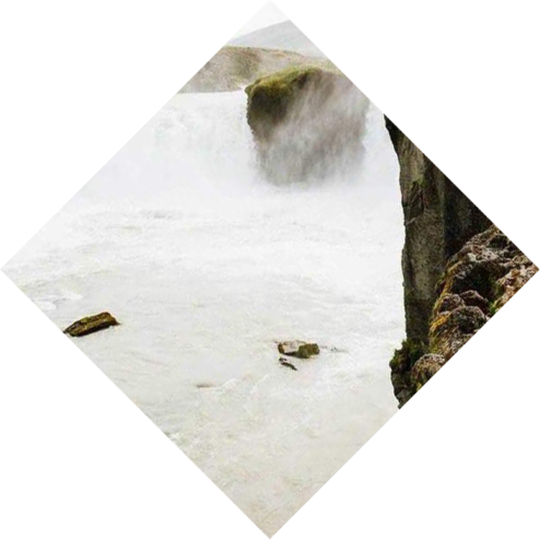
About Angel Falls
Lorem ipsum dolor sit amet, consectetur adipisicing elit, sed do eiusmod tempor incididunt ut labore et dolore magna aliqua. Ut enim ad minim veniam, quis nostrud exercitation ullamco laboris nisi ut aliquip ex ea commodo consequat. Duis aute irure dolor in reprehenderit in voluptate velit esse cillum dolore eu fugiat nulla pariatur.
Location: Venezuela, South America
Elevation: 4,209' (1,283 m)
Number of drops: 2
Longest drop: 2,648' (807 m)
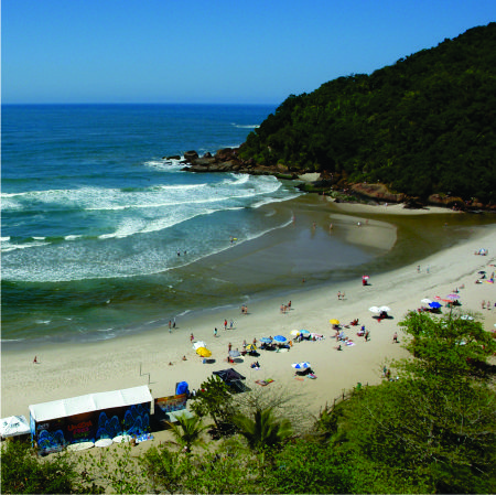
Venha conhecer a melhor praia de Ubatuba, venha para Itamambuca!


 Lorem ipsum dolor sit amet, consectetur adipisicing elit, sed do eiusmod tempor incididunt ut labore et dolore magna aliqua. Ut enim ad minim veniam, quis nostrud exercitation ullamco laboris nisi ut aliquip ex ea commodo consequat. Duis aute irure dolor in reprehenderit in voluptate velit esse cillum dolore eu fugiat nulla pariatur. Excepteur sint occaecat cupidatat non proident, sunt in culpa qui officia deserunt mollit anim id est laborum.

